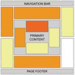
The landing page is a web page where people go to once they click on an online advertisement or natural search listing. Landing pages are designed to be highly relevant to the advertisement or search listing and encourage users to complete a “call to action”. The landing page is also known as the “click through URL” or “destination URL”. Herewith I am blogging about how to build successful landing pages for higher goal conversions along with some useful tips.
Here are tips for a successful landing page:
-
A heading that includes the visitor’s search terms.
-
A color photo of the product. Use professional photographs, and add a caption.
-
A selection of models, colors, and features. Offer comparisons and explain the advantages and disadvantages. State the price on the page. If you write “Click here to learn about our prices,” visitors generally go back to the search engine. You can also offer discounts, free shipping, no sales tax, a money-back guarantee, and similar.
-
A professional layout. A professional layout works better than amateur design.
-
Keep it to one or two pages. If visitors find a long series of forms, they often quit and go back to the search engine.
-
Remove links that lead your visitors away from your message and conversion goal.
-
Include reviews from trusted information sources, such as reputable newspapers or magazines. To create a sense of confidence, add a list of trusted name brands and vendors. Use logos, including credit card logos.
-
Make the users engaged by asking them to filling out the forms like request for quote, product inquiry, general inquiry, etc.
- Include your business location (if it is applicable), complete street address, city, state, and telephone number.
The landing page’s content also affects your ad group’s quality score. If the content of the landing page matches the keywords and ads, the QS will improve. That’s what visitors want to see. But what about Google? What do they want to see on your landing page? They give higher ranking to merchants who have credible sites.

Here are some points to keep in mind while developing landing pages:
-
Google prefers a landing page with one product instead of pages with multiple offers. Put only one product on each landing page.
-
Clearly identify your business. There are too many scam websites. Google prefers websites that state their contact information. This means your name, address, e-mail, telephone, and fax number.
-
If your landing page use a shopping cart, include useful features. For an ecommerce website allow customers to view the contents of their shopping cart as well as calculate the shipping fees. Add FedEx tracking. Good e-commerce packages include Yahoo! Stores and Volusion.com. Google accepts these as real stores.
-
If you ask for personal information, state your privacy policy. Add a privacy policy to your site and link your landing page to your privacy policy.
-
State your return policy, with details on how to return or exchange products, along with any fees.
-
Don’t build affiliate sites that point to Amazon, eBay, or similar sites.
-
The landing page should open quickly. Google deducts points if your page takes too long to open. This is bad news for many corporate sites that use lots of Flash on their home pages.
The keywords, ads, and landing pages should be in the same language. If you use French keywords and write your ads in French, the landing pages should be in French. Don’t mix languages. You can always use English as the universal language for any country, but preference will be given to ads in that country’s language. Create landing pages that include multiple languages side by side on the page, so everyone can read the page.
Disclaimer: The post is completely based on individual thoughts and SEO Services Group bears no responsibilities for the thoughts reflected in the post.


Hi, interesting post. I have been pondering this topic,so thanks for posting. I’ll definitely be subscribing to your posts.
Hello SEO Services Group, – Thanks to You, and to Vaidhyanathan, for this informative article:- ‘How to Build Landing Pages for High Conversions’. – I am currently in need of this information, especially the- ‘what Google prefers to see in a Landing Page’. Hopefully this will be a great guide, and a big help in creating a winner of a – “click through URL.” – Thanks again, – Joe Ward (ReFidolize)
Hi Again
I really love what you saying and teach here. A professional layout works better than amateur design.
very true. Like Organic search are better of PPC.
Thansk
Pasquale SEO
Hi
Does anybody know if there is an experiment on usability for landing pages regarding its layout.
I always see this layout.
Liked the article !
Pedro
Thank you for the great tips, I am currently creating my marketing plan for my new site.
I have been working with my clients according to these guidelines, and I know it works..
Very informative article . You have covered every aspect regarding landing page design in this article . Thanks !
Thanks for sharing such great Tips…..
I really Found Unique Informations…